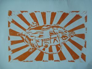
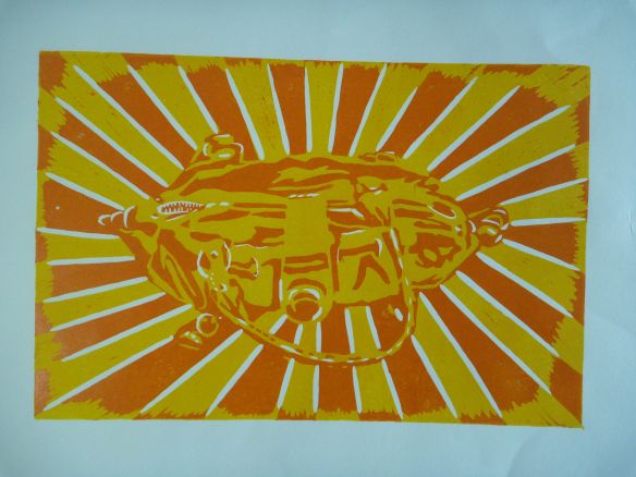
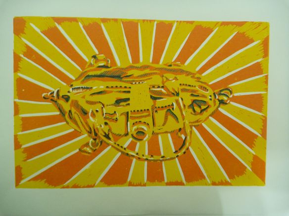
The next layer was the orange one, the first layer of shade. I cut back into the lino, leaving the major areas of shadow, and trying to create some definition. The shape isn’t an obvious one, so I had to try to make it coherent enough to the viewer. Once it was cut, I experimented until I got the shade I wanted, and ended up mixing loads too much ink.
This is the orange layer on its own. I decided to alternate orange and yellow in the background and exaggerate the “sunburst” effect by alternating them again on the outer edge. It’s meant to a light-hearted image. The second layers went on quite accurately, using the jig.
Here’s the orange on yellow. Again I’m struck by the comic-book effect, but that’s such a commonplace that I must stop saying it…
Next was the darker shaded areas. I planned to do two more layers, one in green and one darker one in purple. When I cut this layer I decided to try to create a hatched effect that would apply to the green layer, while the solid shapes would become the purple layer, and created this hatching by using the smallest knife.
It took, again, quite a lot of experimenting to get the right green. I envisaged a mint green, and was surprised by how much white I had to add to get it right. The blue ink is very powerful.
This is the green layer on its own.
I was unsure whether to leave the cut marks in the background, or whether to make it clean-lookin by wiping. (I could also have simply cut around the outside shape of the bag at this point to save wiping, but I wanted to be able to use the jig and that was cut to the rectangular shape of the lino.) I tried a couple of versions with the background cuts showing, then decided I liked the clean versions better.
I was very happy with the look of it at this stage, liking the way the complementary green and orange worked. I also felt the image was clear enough with this amount of definition, and wondered about stopping there.
HOwever, I carried on to see what it would be like. I cut away all the hatched lines, leaving only the darkest shadows. Here is the purple layer on its own.
I decided to do half of the prints with the purple layer and leave the rest to think again.
Here is the completed 5-colour print:
At this point it became clear that exact registering was required. Getting it slightly “off’ had no good points whatsoever, and in fact would cause a headache…
Finally, the version with more layers may look more sharp, but somehow I am still more drawn to the previous one, with only yellow, orange and green. Less is more.
I still have the prints in yellow, orange and green, and wonder what it would be like to do the last layer in red instead of such a dark purple. It would create a pattern of complementary colours, becoming ever darker, and perhaps that would be more harmonious. I’ll have to allow for more prints in future, to give me even more room to experiment.


I’ve loved following your steps through this process – partly because I’ve just started on the Printmaking 1 course myself, but also because of your Chinese rays of the sun image. I have a long-standing interest in China, Chinese, Chinese culture etc, so seeing someone using something I’m familiar with in this way has been especially interesting. I see something in the final image that maybe you hadn’t foreseen – the clash and mixture of the Maoist culture and consumer culture – where I feel the Chinese have pretty much left us standing! The bag is so symbolic of the style of bag that’s taken over the last decade, the time when China’s been having this consumer explosion. Was the bag even maybe made in China, I wonder? Or maybe all that was part of how you always saw this image?
Thanks for your comments and for taking an interest in the progress. Yes, the clash between Chinese “communism” and consumer culture is certainly something that surrounds us here in Hong Kong, so much so that we are all capable of Orwellian-type doublethink and no longer see anything very wrong with it. I could read a number of things into the image of the bag and its rays- not least the fact that people sometimes think that we expats are just here filling our pockets, while at the same time burnishing our images as beings from a superior culture… But on the other hand, it’s just a bag, and it’s yellow, which I love, cos it gives me a good feeling and evokes for me the yellow of van Gogh’s yellow house in Arles, of his sunflowers, of Gauguin’s yellow Christ, of Warhol’s banana on the cover of the Velvet Underground, of a particular stilt house on an island here which I’ve drawn and painted a lot, due to the same set of associations no doubt! So anyone who wants to attract my attention just needs to wear this colour! Do you also have a blog for your printing work? I’d be interested to look at it too.