Monolithic shapes

Monolithic shapes

Feeling a little frustrated with monoprinting, or at least painterly monoprints, as they look a bit fussy.

After seeing the exhibition “Rupestres” I decided to work with more simple shapes: I liked the work by David Nash “Three Stripes”, as it put me in mind of standing stones, which make a statement yet defy interpretation.

http://www.galerie-lelong.com/en/estampes-david-nash-23-p3.html

I used a bit of backrubbing to get a smokey effect on this single negative masked shape, inspired by Three Stripes.

Standing Stone I

In this positive masked shape, the use of coloured textured paper adds atmosphere to a very simple image; by pressing on some parts of the edge more than others, the outline is kept quite rough. I rubbed the positive shape directly with ink on my finger to add some rough texture to it.

Standing Stone 2

This double masked image was done by making a suggestive pattern using a wooden spoon on the back of the page during the positive masking, and leaving some gaps in the white ink in the negative one.

Standing Stone 3

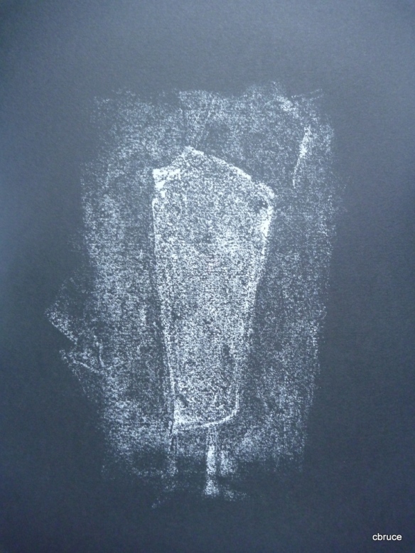
Finally a ghost print from the white inking, on black paper.

Standing Stone 4

I’m happier with these simple images than ones I’ve done so far: their simplicity seems more effective than the fussy decorativeness of the earlier ones. It’s a question of subject matter.

But I haven’t succeeded in keeping the subject matter as ambiguous it could be. This would be something to explore further.

Bonfire of the Vanities

Bonfire of the Vanities

I don’t know why this title came into my head, or why it was accompanied by an image of a red gallery in which the decomposed lines from the artworks were all lying on the floor. However it did, and I thought it might be a subject for a print.

I wanted to make a very solid red single masked shape suggesting a gallery with pictures: I sketched a few options and then chose one with the perspectives of two walls, as this gave the most interesting shape per se, but also communicated the best. I tried to ink this very thickly, as I didn’t want a speckled finish this time. As a result some of the ink has squeezed out from the sides of the mask and the lines aren’t completely straight. After leaving that to dry, I used a dark-grey inked plate, which had been left in the very hot sun to dry, to backdraw lines on the print. I like the contrast between the hard shape and the soft lines, the bold shape, and the simplicity of the colours. If it were possible to emboss the paper, that might be a good development. The thick ink has left a raised surface on the print- this has also picked up ink from the grey plate and so the red has got a bit dirtied, but I don’t know how to solve that.

Bonfire of the Vanities I

Using the same colours- as I think it’s the colours of fire and ash that make me relate to the title- I made another simple shape and again used backdrawing. Ostensibly it’s a vase and dead flowers, but it could refer to any process of dissolution.

Bonfire of the Vanities II

Hollyhocks

acrylic painting: "Hollyhocks"

Hollyhocks

Version 1:

Inspired by this acrylic painting (my own) which I’ve had sitting on my mantelpiece for years now- and also of course by the hollyhocks themselves, which, despite the heat and lack of water are still surviving, I decided to make a design on the subject. Mindful of the need to work with simple shapes and clear images, I simplified it down to a linear composition, with near repetition in the shapes and colours.

sketch

The first version used a combination of masking and painting.  I laid the positive shapes and made the yellow background.

negative shapesusing masks as guidesselective inking

Then, still wary of masking the printing surface, as it’s so hard to get the placement right, I cleaned off the yellow ink, leaving the masked sections. I was still debating with myself how to go on with this, but decided after all to use a mask for the green parts. I did this by removing the masking still on the printing glass, and only inking the appropriate areas of the glass, using the masks remaining on the glass as a guide. The green came out a little vague in parts, probably because of all that was going on at once…

Then, stage 2, I removed the remaining masks, cleaned the ink off, leaving the outlines  and painted into these outlines. I used folded paper to clean off lines in the flowers and leaves.

I thought the result was little “antiqued” in its effect, and wanted to try a more modern, streamlined effect.

version 1

Version 2:

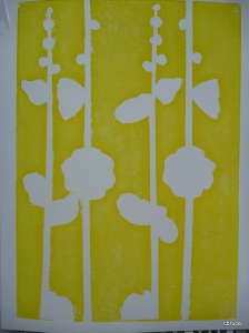
For this version, I had realised that I could simplify the masking by doing two colours at once, inking different halves of the glass. I repeated the negative shape in yellow, this time only using 3 masks instead of four (the fourth one, a green shape, would be printed in blue over the yellow to give green). Then inked the plate in two halves , one half in blue,  the other in green, so as to produce the two green positive shapes. I masked the printed page, not the glass. For the green being printed over the white paper, I stretched the two sides of the mask so that there would remain a white edge.

Then, did the same for the red and the pink, again stretching the masks so that a white edge remained, and inking the plate in two halves.

This resulted in a quite clean image, simple and stark. I was quite pleased to have cut down the number of steps involved.

version 2

Version 3:

This was a return to the painting style of version 1, but this time all parts were done in brushwork, including the yellow background, which was brushed on using the masks still in place on a glass used in version 2. I removed the masks afterwards, leaving the outlines. Then the 4 hollyhock stems were painted into the outlines one at a time, so that there would be no difference in the dryness of the paint. I fixed the paper with tape and flipped it over each time to make a new impression. The result is a much more painterly effect, even more “antique” than the first. As this time, Ididn’t clean off all the yellow on the glass on the flower shapes, there is also a slight gilded effect there where dry yellow has lifted off.  My favourite though is the second. (I wonder sometimes the point of creating painterly effects- why not just paint on paper?)

version 3

 More versions: 
Using a pallette knife, I put colours on the printing plate in very roughly the same arrangment as in the original acrylic painting, and laid the positive masks on the glass in diagonals. 

inked plate using palette knife

 
Positive masks laid in diagonals:

masked print


Then I used the inked masks to make another print- this could have been done more carefull, but is somehting to explore further.


postive print using inked masks

Spain, and Bulls


Spain and bulls

Wanted to go back to the Spanish theme, and include some reference to bulls- I know it’s a bit of a tourist cliché, but I wanted to include the vibrant reds and yellows that you see on touristy stuff (and blacks- though I don’t have black ink..) I was also remembering the big black cut-out bulls that dominate the countryside- perhaps because of their being cut-out, they always put me in mind of masked monotypes.

Started by looking up artists who have celebrated Spanishness in some way- Picasso and Miro and did some sketches, copying their images of bulls. Also looked up the internet for the cut-out ones, and found they are available as bumper stickers, t-shirts and everything. There was a cut-out conveniently provided on the internet too, which I must admit tempted the lazy part of me for a moment… Then realised it would be stupid to take something mass-produced and turn into a monoprint.. (I am resolutely  not going down the “irony” route here…)

Played around with some shapes and did a plan for a print using a bull shape in the background of Miro’s “La terre laboree”, planning to use red, black (or as near as I could get), white reserved, and yellow overpainted.

Miro bull

But kept going back to the Picasso etchings, which were amazing, so full of life and movement.  There were two that I liked- one showing a defeated bull about to be killed by the matador, the other showing a victorious bull rearing up. I sketched these and tried to turn them into more solid shapes than the light-of-touch etchings.


Using the defeated bull picture,  I made masks and did two contrasting pictures. I was more ambitious with the mask this time, using small cut-out shapes, as my plan was to mask the printed page, not the glass.

Version 1: White bull, black shadow and yellow overpainted sun. “Espana” written down the side as backdrawing. It’s not supposed to look like a smooth tourist poster – the writing is more like spray painted graffiti, of the kind we saw often in Northern Spain, thought usually for Basque separatism. And the bull is a defeated one. (Although it is a bit ambiguous now- looking like it might also be about to charge.)

Espana


Version 2

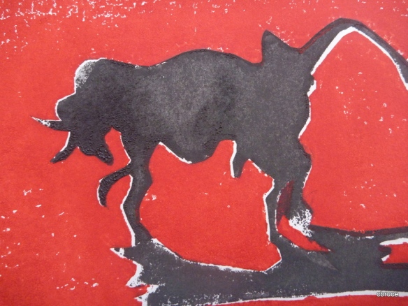
Black bull on red. I placed the mask onto the printed page with a bit of misalignment created so as to have some white highlights. The red is more solid this time and the shape of the bull is more direct, iconic, dramatic. I decided to leave it, and like the ambiguity of the image.

black bull

The registration on this one still went wrong though, as one of the small shapes moved during printing.

detail

Backdrawing

I painted a glass plate with a dark grey mixture, and left it overnight to dry. Then I set the two bulls, the victorious and defeated, against each other as a backdrawn print. I like the soft effect- it’s rather reminiscent of the charcoal cave paintings in places like Lascaux,  or spray paint graffiti. I was tempted to add text again, as backdrawing lends itself to that, but couldn’t decide what to add. Captioning is difficult: saying something that’s obvious is pointless, and titling can reduce the potency of an image. Again, I could just put “espana” which could be politically apt. Or “Victor”, placed centrally on the page, begging the question of what victory amounts to.  The defeated bull image is one I am attracted to, with the idea of dignity in defeat.

Victor

Pears and leaves

Pears and their leaves

Subject: Pears and leaves

Methods: Double masking, object printing, brushing

Four colours: red, yellow, blue, green

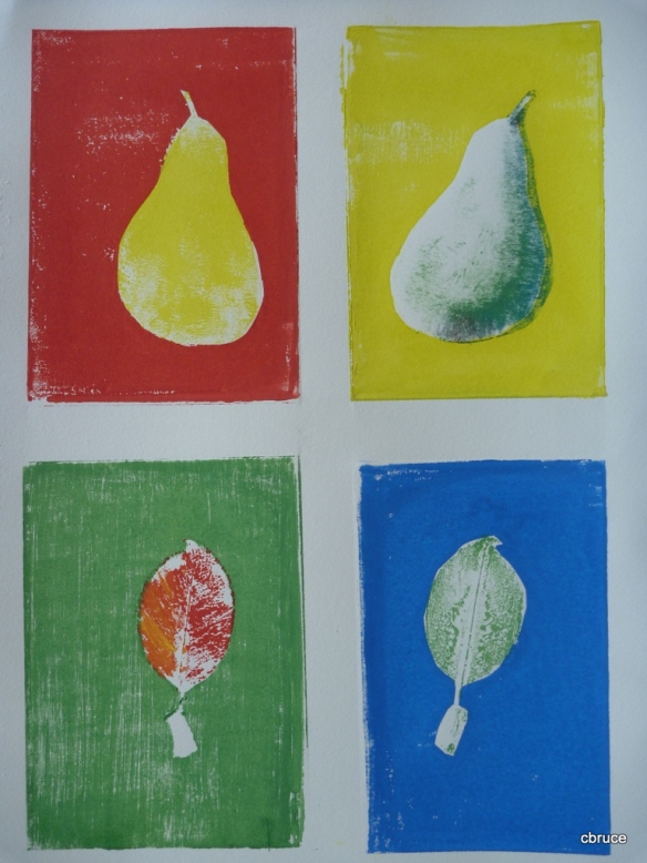
Today, channelling Andy Warhol, and therefore probably doing something that would work better as a screen print, I tried to combine effects into a print that was somehow also a reflection or commentary on monoprinting itself, some kind of reminder -to -self. (Kind of like stitching a sampler…)

Started with a (not-so as it turned out) cunning plan, and improvised as I went along. It had started out as in idea jotted in my sketchbook of using a 4-colour grid (a la Warhol)- and introducing variations on positive and negative masking- the kind of thing I did with the Egyptian figures, but this time with four.

Started with masking the glass into 4 sections- this was a mistake, I realised at the end. Or at least I should have taped the other side of the glass, not the printing side. Anyway, this is a learning experience. Decided to use shapes from my environment, so chose the pear tree in the garden, and drew the shape of a pear to make a template. The second related shape was a leaf taken off the tree.

First, I put the positive mask shape in the top corner, after rolling on a yellow background. This is when I started to realise the masking tape needed to be put on afterwards, as it was hard to roll up to the edges. Parallel to this, the negative mask was put down and the positive shape rolled in yellow. I tried to roll this a bit unevenly so that there would be still be white highlights on the pear shape. Printed both of these at the same time.

Then, fixed a leaf onto one of the bottom squares with tape, and, because it’s hard to roll over a solid object, and didn’t want to press the paper onto it either,  painted the background around the leaf with a brush, keeping the brushstrokes as even as possible. Printed this.

Then lifted the leaf, pressed it into green ink and used it to make an impression onto the adjacent square. Printed this.

yellow and green

Using the positive pear mask, laid a red background on the other top square. This time I masked the print surface.

Then, used the leaf to make a mask for the bottom corner, and printed a blue background.

positive masks

Next, I added some detail to the pear at the top, by painting into the negative mask shape. Used the three other colours, blue, green and red. The misalignment worked to make another colour with the yellow.

added brushwork

Finally, painted the front of the leaf using red and yellow and made an impression directly onto the printed page.

final print

Another Spanish landscape

Friday

I can’t believe how long it takes to make a print that doesn’t look like very much…

Subject: Spanish Landscape with cypress trees

I used a blurry photo taken through the car window: I like the colours and simple shapes.

blurry photo

Sketched and planned the colours, and the mask, but wasn’t sure how I would use the mask, as I get frustrated by the halo.

Sketch:

I prepared a couple of masks, and mixed the colours, and tried again to use masking tape on the printing paper and printing plate so as to flip the printing paper over and hopefully keep the registration reasonably ok.

Colours: for the sky, I tried to blend dark down into lighter blue by mixing on the roller. This was applied then the positive mask put in place.

graduated colour
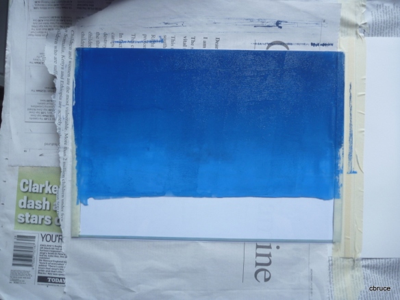
rolled onto plate held by masking tape

mask in place

Secondly, I used yellow, which, being more transparent, was going to make green when overlapping part of the blue. This I rolled on, and I decided against using the mask, as the transparency of the ink let me see the outline of the sketch lying under the glass, so I was able to wipe off instead.

yellow layer

wiping off
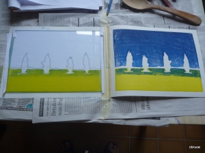
yellow overlapping blue to make green

The next stage was to use a negative mask for the trees. I was fairly confident of getting it placed, but wanted a bit of white highlight on the trees anyway. I placed the upper and lower masks onto the glass, rather than onto the printing paper, as I wanted  a bit of misalignment for highlights.

negative mask

This worked quite well, and I like this print. The sky has starry texture, and the bubbles caused by thick paint where it has been wiped off add to the effects. I think the yellow/blue colour mixing has worked well, and there is some gradation in the sky colours, though perhaps not as much as I’d hoped. The highlights work.

final print

Version 2

Just for the sake of experiment, I thought I’d try using the mask differently, inking over it to avoid halo effects.

I started by inking over the positive mask with blue ink. It was hard to get a smooth finish, but I thought I could make a virtue out of a necessity and use the roller to make a textured finish. The problem was getting the mask, which was quite small, with narrow parts, to stick to the glass. I used a little spot of glue stick, which I thought I could roll off with my finger afterwards.

roller texture

yellow, followed by negative masked trees

The next step was the yellow foreground: like last time I did this by rolling and wiping. Next was the trees. I taped the negative masks to the printing paper to try to avoid misalignment. There was still a little though.

I wasn’t too happy with the result, and preferred the first version. The glue hadn’t come off completely, and I cheated by dipping my finger in the ink to fill in the little bits that hadn’t got covered.

I thought I would continue to experiment, and worked on the sky.

I started by cleaning off the ink that was still on the glass after printing the trees, then I removed the negative masks and wiped around the hard edges left by them.

glass

Working with a brush I painted light blue onto the glass, right up to the hard edges of the tree shapes.

I printed this, and it had toned down the texture in the sky, but not enough, so I applied some thicker paint to the top of the glass.

This still wasn’t effective enough, so I decided to try to redo the sky completely, be re-rolling it and then wiping it, using the outlines of the hard edges which were still visible.

That worked quite well, but I still prefer the first version of this picture, as it’s simpler. The second one looks rather overworked.

second version

version 1